Mannum Museum and Township Branding
Branding / Print / Logos / Web Design / Signage / Video
Great River History:
Branding helps define a Murray River heritage icon and destination
The Challenge
Mannum and the Mannum Dock Museum have many opportunities. When I first started working with the Museum they needed help with their website and interpretive displays. My assitance grew from there.
The Solution
The decision making was part of a committee. Projects would on a merit by merit case depending on what the museum wanted to achieve.
The Deliverables
- Website
- Logo
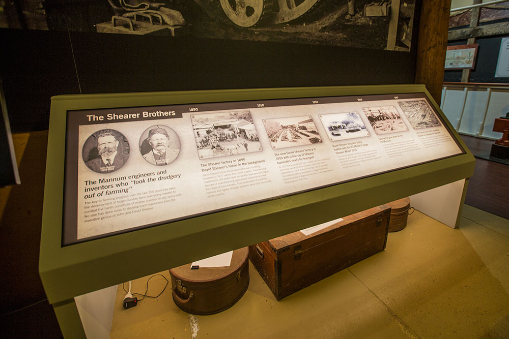
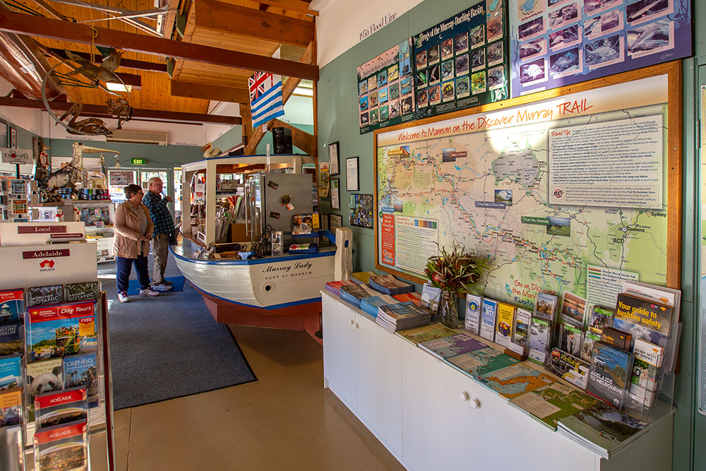
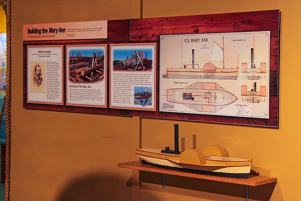
- Displays
- Graphic Design
- Interpretive Signage
The Process
We worked with both the Mannum Dock Museum and the Mid Murray Council to develop new tourism and heritage communication strategies.
PS Marion website
The psmarion.com website is a digital gateway to one of Australia’s most treasured heritage vessels – the PS Marion. Designed to preserve and promote the cultural, technical and social history of this historic paddle steamer, the site showcases the PS Marion not just as a paddle steamer, but as a living, breathing piece of river history.
From a design and visual communications perspective, the site balances authenticity and accessibility – combining heritage aesthetics with intuitive navigation to appeal to educators, historians and the general public alike. High-quality imagery, archival content, and modern layouts work together to reinforce the vessel’s ongoing relevance and ensure a lasting legacy. The focus is not only on preserving the PS Marion but also on engaging future generations to understand, support and experience river heritage as a vital piece of Australia’s national identity.
visit psmarion.com
Mannum Region Video
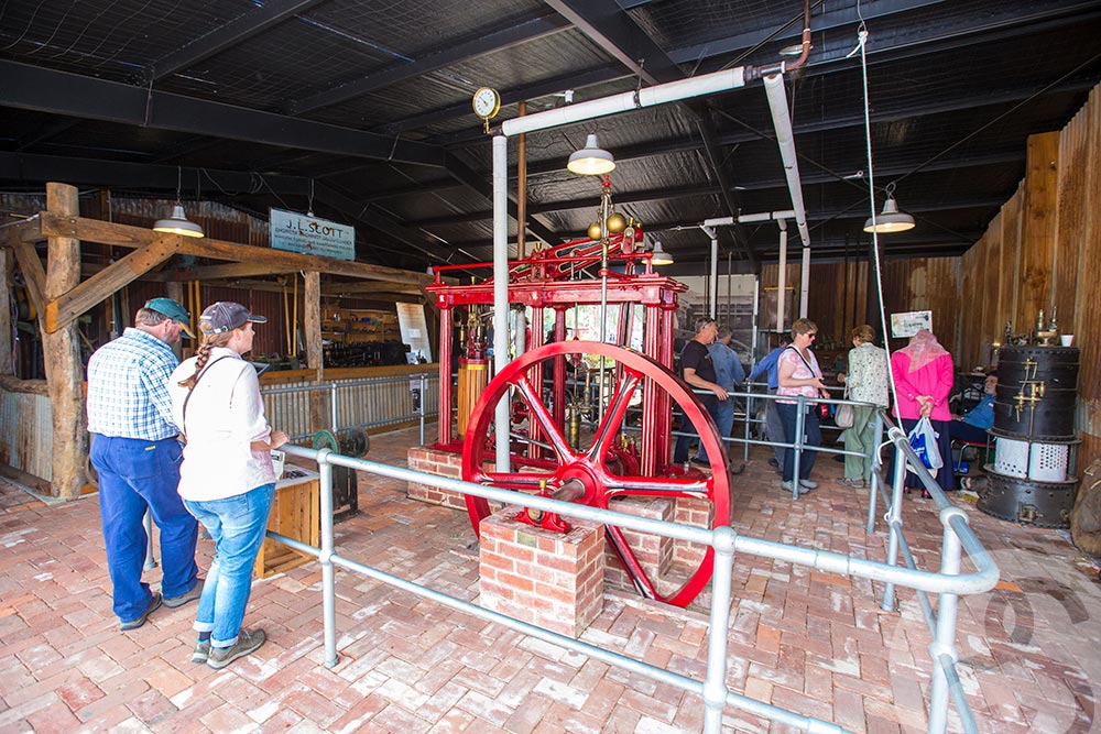
End of the River Trade Interpretive Display Mannum Museum
The Mannum Dock Museum of River History approached Brand Action to design an interpretive display depicting the end of the river trade.
Using a combination of supplied resources of newspaper, photos and stories, we designed a panel as a story of the last trip by a paddle steamer. We also supplied illustrations from black and white concept to give life to the display.
The background kept in them with other elements of wood, steel etc with the use of a wool bale material texture to both add mood and emotion to the design.
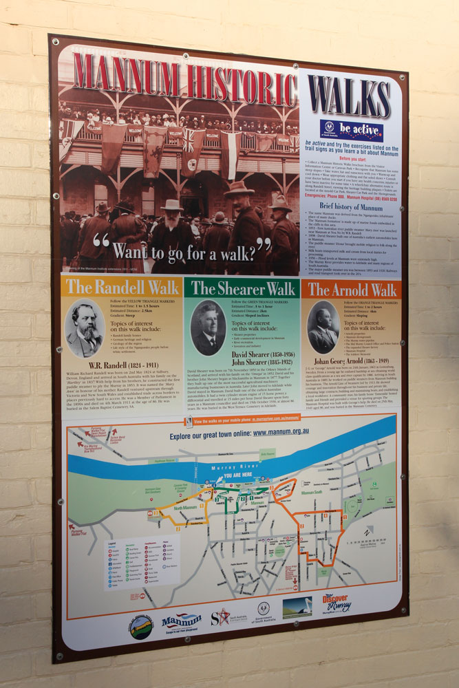
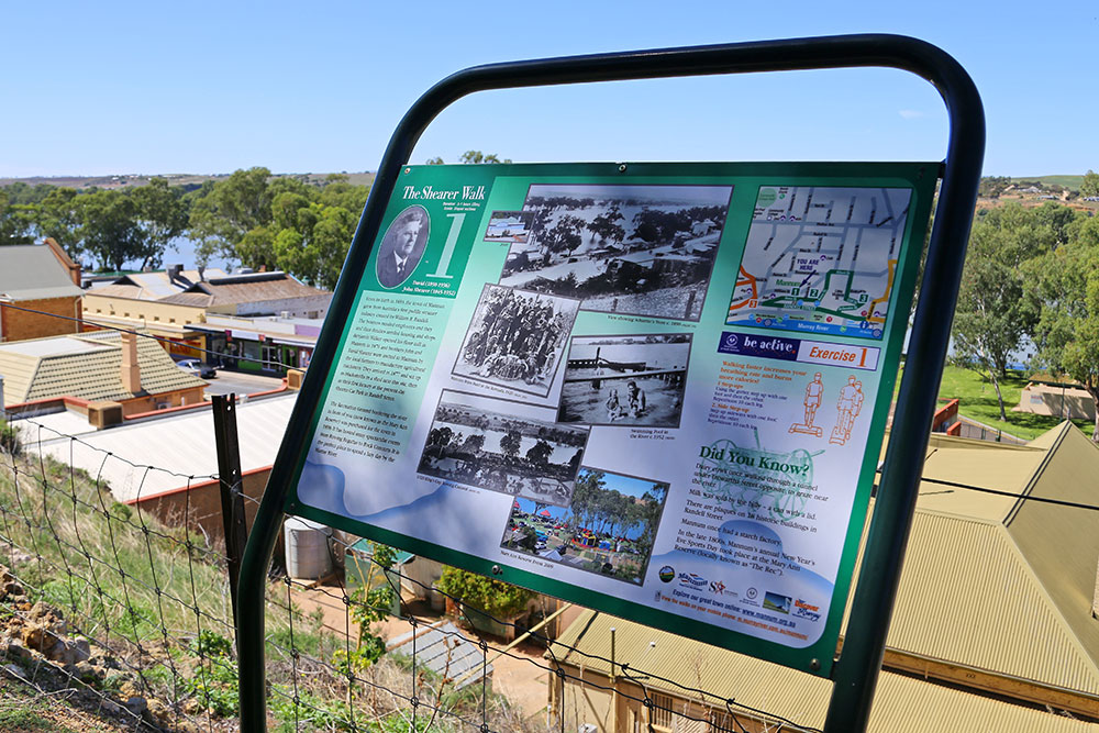
Mannum Heritage Walks
The Mannum Heritage Walks design combines clear wayfinding with a strong sense of place, using earthy tones, historical imagery, and consistent typography that reflects the town’s character and connection to the Murray River. Designed to be accessible and engaging, the walks are supported by detailed maps, interpretive panels, and a digital guide that bring Mannum’s rich river trade, paddle steamer, and colonial past to life. The visual style balances heritage authenticity with contemporary usability, creating a cohesive storytelling experience that guides visitors through the town’s layered history while encouraging exploration at a relaxed, self-paced rhythm.
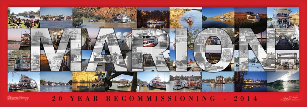
PS Marion 20 Year Recommissioning Poster
My passion for the Murray River and its heritage is wide known. The PS Marion is a beautiful paddlesteamer having photographed for a very long time I designed this 20 Year Recommissioning Poster with a range of my images I’d shot over the years. Through the typography in the middle was the use of historical images showing the PS Marion in its glory!
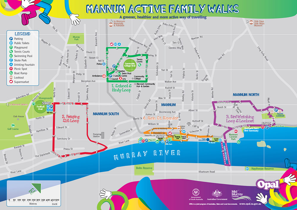
Mannum Active Family Walk Opal Maps
Working with OPAL, I designed a bright, colourful and informative A3 map for the Mannum township to encourage both local families and visitors to explore the area. Taking in 4 different routes the map was aimed at getting families active and exercising. Our work included on the ground research to define the different visitors assets and experiences along with photography for the reverse side of the map. There were 10,000 maps printed and distributed as well as promoted on the Discover Murray River website as a pdf.
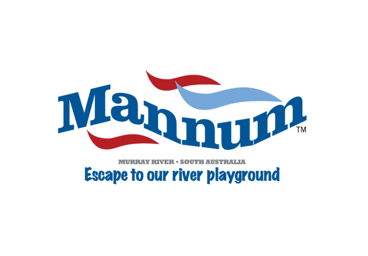
Mannum Logo
The Mannum logo is a bold, playful identity designed to capture the town’s appeal as a vibrant riverside destination. The dynamic typography of “Mannum” is set in a confident serif font and gently curved to mirror the flow of the Murray River, while red and blue wave elements reinforce the water-based lifestyle and heritage focus. The tagline “Escape to our river playground” sits beneath in a relaxed, hand-drawn style, adding warmth and personality. Together with the location anchor “Murray River · South Australia,” the logo balances tourism appeal with regional pride, creating an inviting and memorable brand mark for the town.
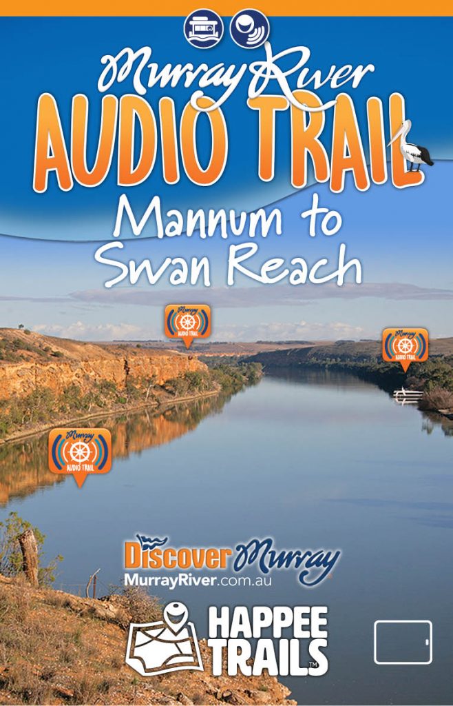
Mannum to Swan Reach audio eBook guide tablet
Tablet iPad Version: This is an on river audio tour…by boat only. The lower stretches of the Murray River between Mannum and Swan Reach are a houseboating mecca with their massive limestone cliffs. This audio guide ebook hosted by Trevor Bedford takes you on a tour of the river with a river captain who explains the points of interest, environment and history on this spectacular part of the the Murray. Great for people houseboating or cruising!
Distance: 96km (By boat)
Trail style: By boat (can be done in 1 day)
Format: epub
Style: tablet/ipad device
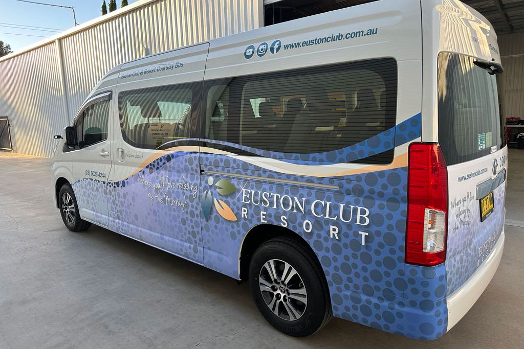
Euston Club Resort Station46 Branding
CLIENT: Euston Club Resort
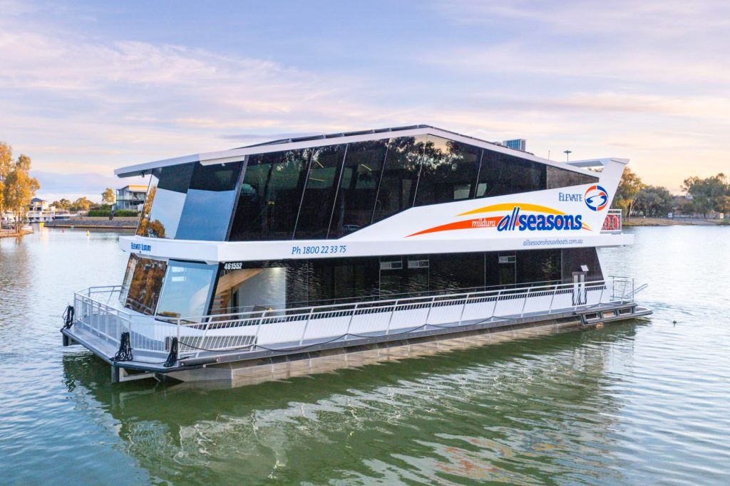
All Seasons Houseboats Branding
CLIENT: All Seasons Houseboats
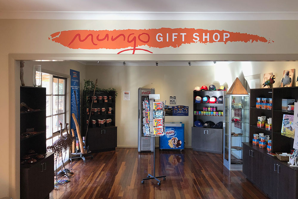
Mungo Lodge Branding
CLIENT: Mungo Lodge
Brand Projects that Create Success
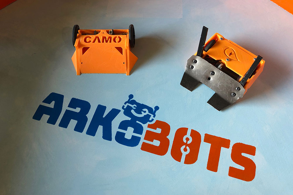
ARKObots Branding
Branding developed with a young entrepreneur at high school for his educational combat robots focused on STEM learning methods. More >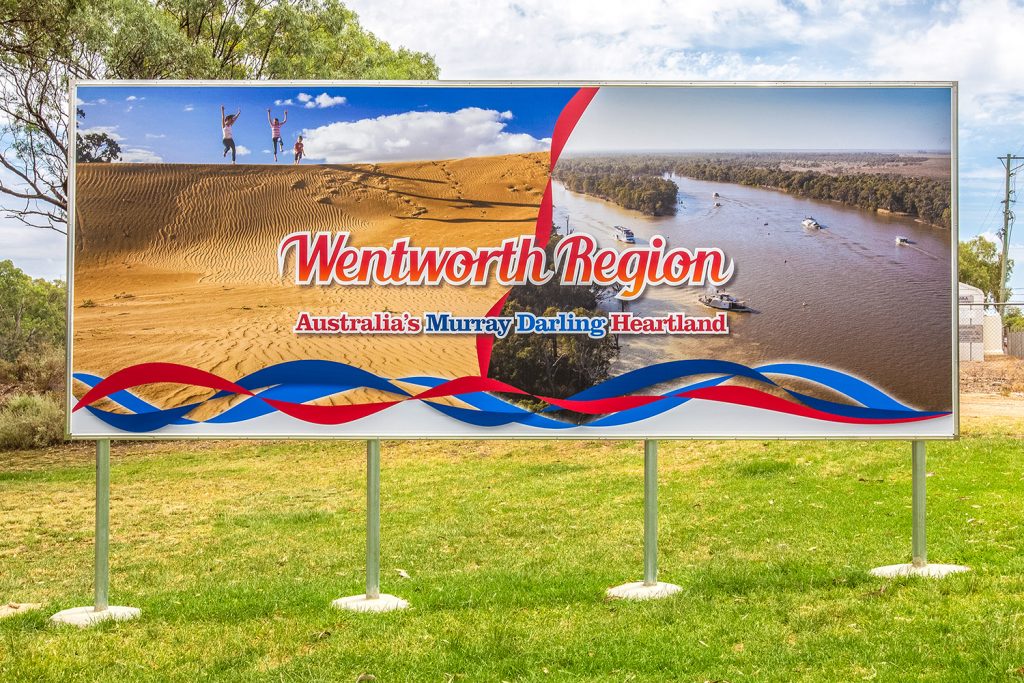
Visit Wentworth Tourism Branding
This tourism marketing strategy was built on 10 core principles. The brand worked for the Shire, community and industry. A brand that can be used across the entire region and a defined point of difference. More >
Mannum Museum and Mannum Township
Working with the Mannum Dock Museum of River History and the Mannum community has been very enjoyable. The museum is the heart of tourism in Mannum and is continually working towards improving its presence for visitors. More >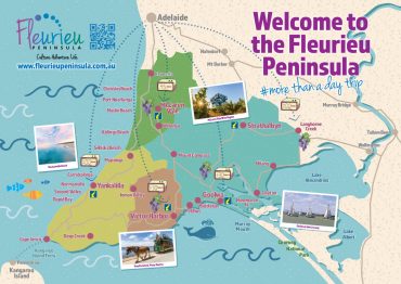
Fleurieu Penisula Tourism Branding
Once I’d worked through the current brand needs of the client we started developing different visual identity elements from both offline to online that aimed to continually build the tourism presence in the region. More >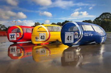
Norwood Morialta Pedal Prix Branding
The pedal prix team at Norwood Morialta High School had an opportunity to use pedal prix to promote the school and improve its image on the track. I developed a brand strategy to take implement the branding. More >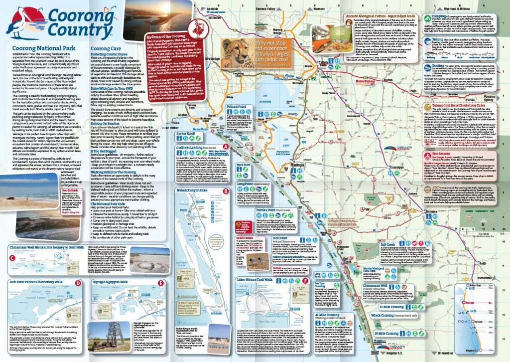
Coorong Country Branding
The Coorong and Meningie region used to be a lost landscape of natural beauty, history and indigenous culture. Developing the Coorong Country brand and supporting the local community has been very rewarding More >


