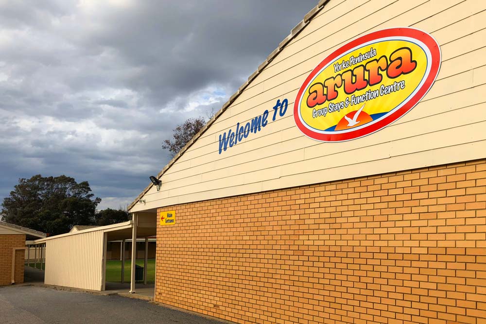
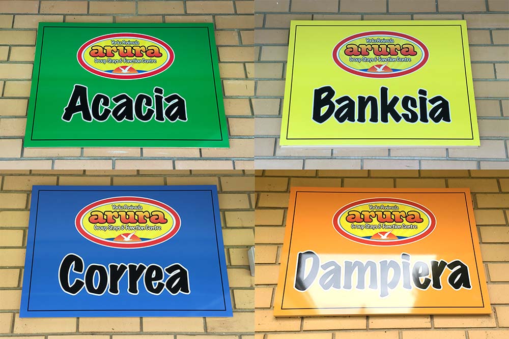
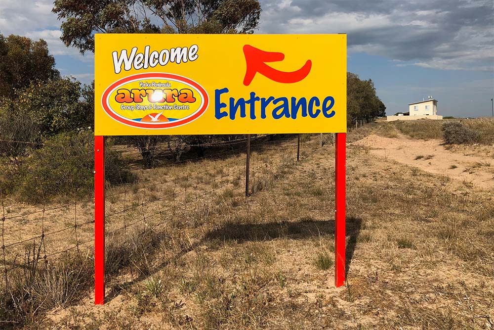
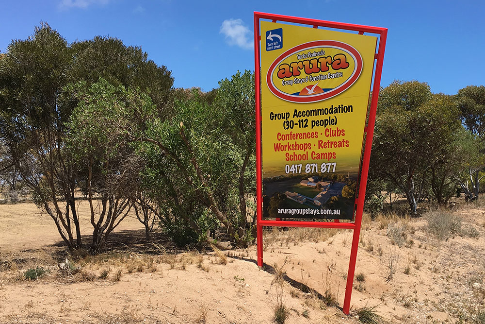
Arura Group Accommodation signage
Client
Sector
Signage
Tourism Region
The Arura Group Stays & Function Centre signage brings the logo’s cheerful identity to life with a design that’s fun, colourful and deliberately welcoming. The bright red oval frame, warm yellow sunburst background, and playful typography work together to attract families, school camps and community groups looking for a relaxed, inclusive place to stay. The rising sun and soaring bird symbol evoke a sense of freedom and coastal calm, perfectly aligned with the Yorke Peninsula setting at Port Hughes and Moonta. The roadside sign’s angled red frame cuts through the natural landscape, making it easy to spot while giving off a casual, upbeat vibe. On the building, the signage integrates seamlessly into the architecture while reinforcing Arura’s reputation as a friendly, flexible destination for group retreats, events and adventures. It’s cohesive, confident and designed to make people feel at ease.
Related projects you can Discover
ARKObots Branding
Branding developed with a young entrepreneur at high school for his educational combat robots focused on STEM learning methods. More >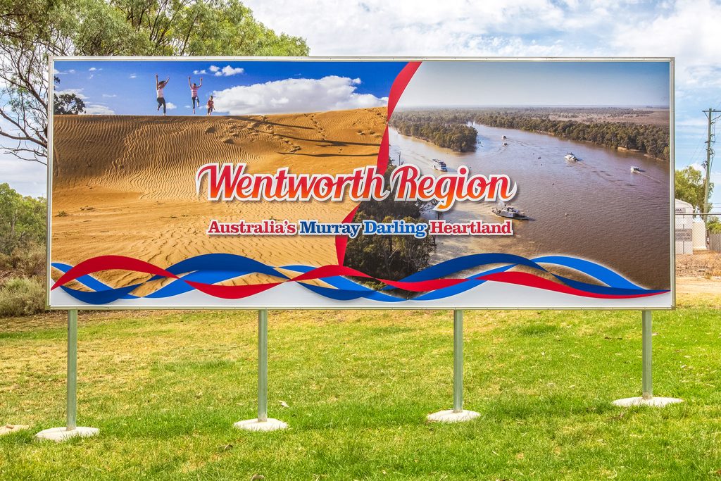
Visit Wentworth Tourism Branding
This tourism marketing strategy was built on 10 core principles. The brand worked for the Shire, community and industry. A brand that can be used across the entire region and a defined point of difference. More >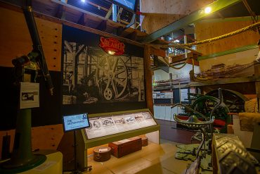
Mannum Museum and Mannum Township
Working with the Mannum Dock Museum of River History and the Mannum community has been very enjoyable. The museum is the heart of tourism in Mannum and is continually working towards improving its presence for visitors. More >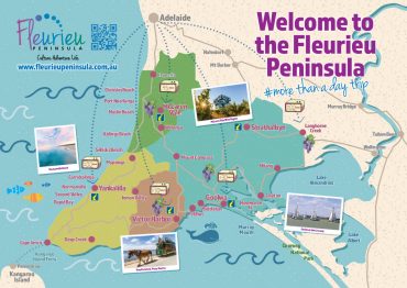
Fleurieu Penisula Tourism Branding
Once I’d worked through the current brand needs of the client we started developing different visual identity elements from both offline to online that aimed to continually build the tourism presence in the region. More >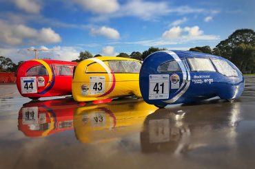
Norwood Morialta Pedal Prix Branding
The pedal prix team at Norwood Morialta High School had an opportunity to use pedal prix to promote the school and improve its image on the track. I developed a brand strategy to take implement the branding. More >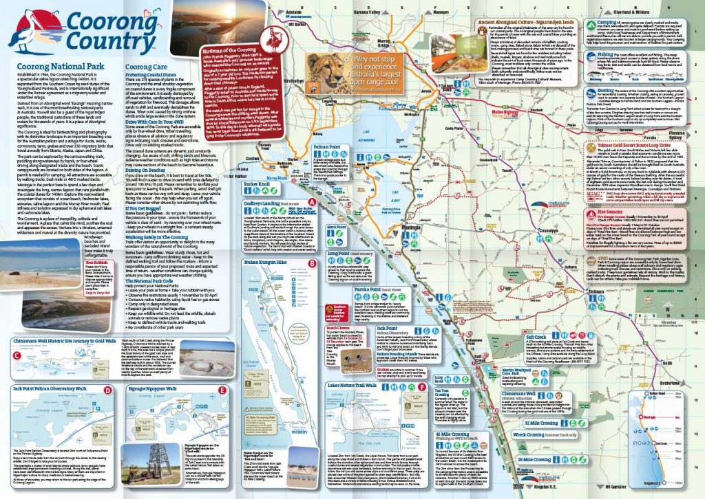
Coorong Country Branding
The Coorong and Meningie region used to be a lost landscape of natural beauty, history and indigenous culture. Developing the Coorong Country brand and supporting the local community has been very rewarding More >