
Robe Tourism Logo
Client
Graphic Design
Photography
Sector
Tourism Region
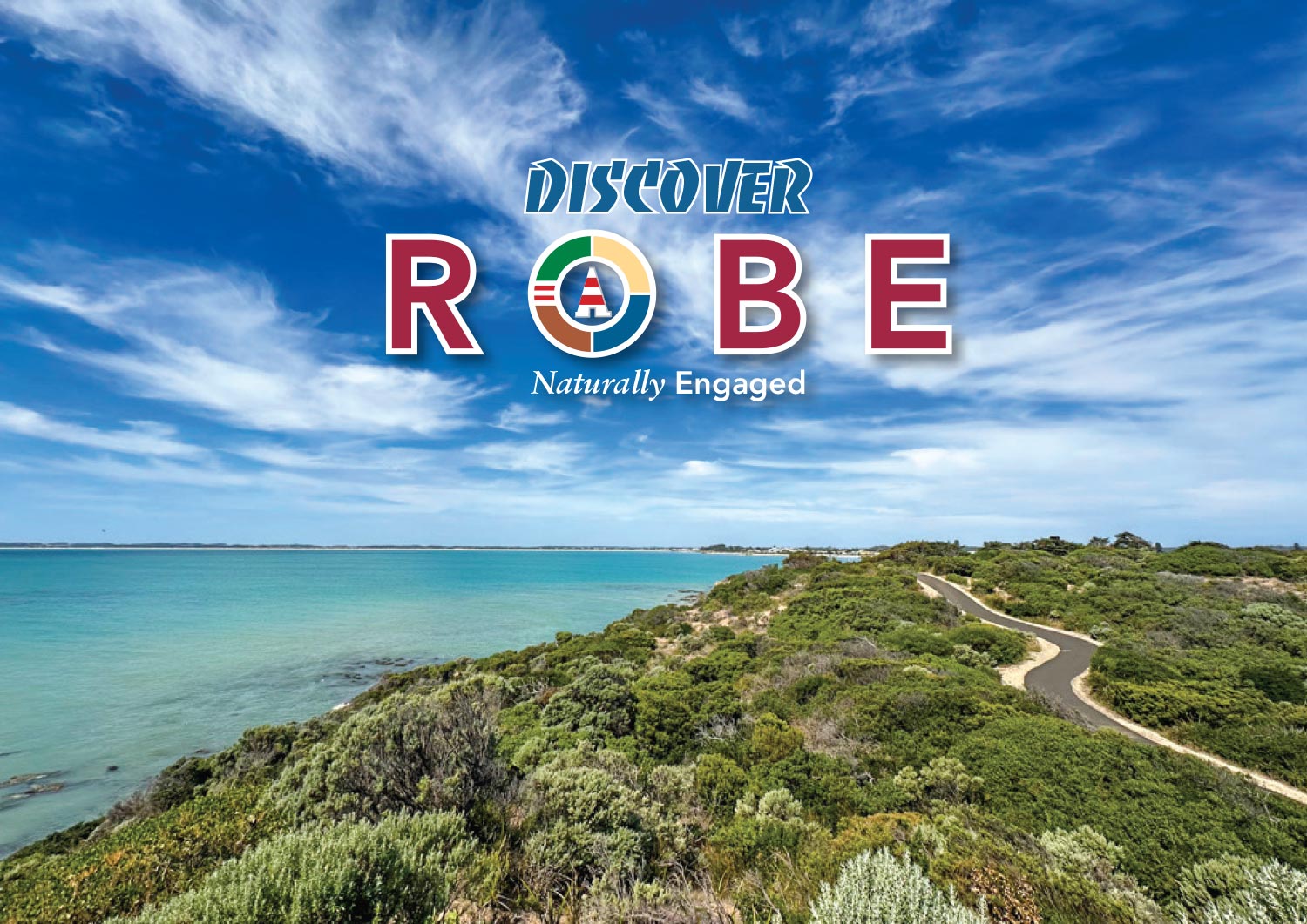
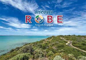
The Robe logo draws its identity directly from the town’s established entrance sign, creating an immediate connection between the brand and the destination itself. It is a contemporary interpretation of Robe’s history, landscape and character, bringing together the elements that make the town distinctive.
At its centre is the iconic Robe Obelisk, one of South Australia’s most recognisable coastal landmarks and a symbol that has guided visitors and mariners for generations. Positioned within the circular device, it represents the town’s enduring heritage and acts as the focal point of the brand.
The surrounding four-segment circle reflects the four defining qualities of Robe:
- Heritage – celebrating the town’s rich maritime and architectural history.
- Nature – acknowledging the surrounding landscapes, Little Dip Conservation parks and native environment.
- Sand – representing Robe’s renowned beaches, dunes and relaxed coastal lifestyle.
- Ocean – recognising the powerful Southern Ocean that has shaped the town’s identity and economy.
The bold deep red typography reinforces Robe’s status as one of Australia’s premier heritage holiday towns, conveying strength, permanence and historical significance while ensuring the destination name remains the dominant visual element.
Supporting the logo is the brand line “Naturally Engaging.” More than a tagline, it expresses the essence of the Robe experience. It reflects a destination where visitors naturally connect with history, nature, the coastline, local community and authentic experiences. It captures Robe as a place that invites exploration, encourages longer stays and leaves lasting memories.
Together, the logo and brand message create a timeless identity that honours Robe’s past while presenting a welcoming, contemporary destination for future generations.
ARKObots Branding
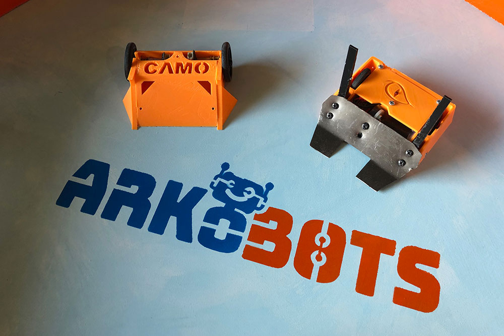
Branding developed with a young entrepreneur at high school for his educational combat robots focused on STEM learning methods. More >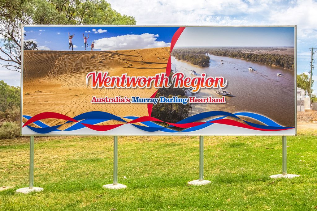
Visit Wentworth Tourism Branding
This tourism marketing strategy was built on 10 core principles. The brand worked for the Shire, community and industry. A brand that can be used across the entire region and a defined point of difference. More >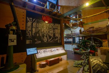
Mannum Museum and Mannum Township
Working with the Mannum Dock Museum of River History and the Mannum community has been very enjoyable. The museum is the heart of tourism in Mannum and is continually working towards improving its presence for visitors. More >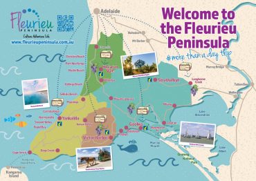
Fleurieu Penisula Tourism Branding
Once I’d worked through the current brand needs of the client we started developing different visual identity elements from both offline to online that aimed to continually build the tourism presence in the region. More >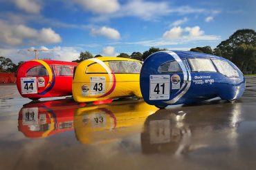
Norwood Morialta Pedal Prix Branding
The pedal prix team at Norwood Morialta High School had an opportunity to use pedal prix to promote the school and improve its image on the track. I developed a brand strategy to take implement the branding. More >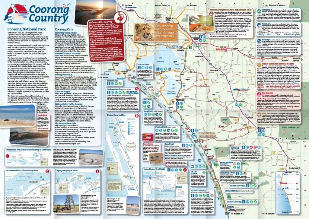
Coorong Country Branding
The Coorong and Meningie region used to be a lost landscape of natural beauty, history and indigenous culture. Developing the Coorong Country brand and supporting the local community has been very rewarding More >