Australian Recumbent Network logo
Graphic Design
Sector
The Australian Recumbent Network (ARN) logo is a bold, kinetic mark that captures speed, movement and community through its design. The central graphic – a stylised, circular motion blur – suggests wheels in motion, aerodynamic flow and the forward momentum of recumbent cycling. The strong, italicised “ARN” typeface in red reinforces performance and energy, while the clean, modern sans-serif tagline below balances the design with professionalism and clarity. The red, white and blue palette gives the logo a distinctly Australian identity, while visually linking technology, sport and national pride. It’s a dynamic identity that reflects both the niche engineering of recumbent bikes and the collaborative spirit of the network.

ARKObots Branding
Branding developed with a young entrepreneur at high school for his educational combat robots focused on STEM learning methods. More >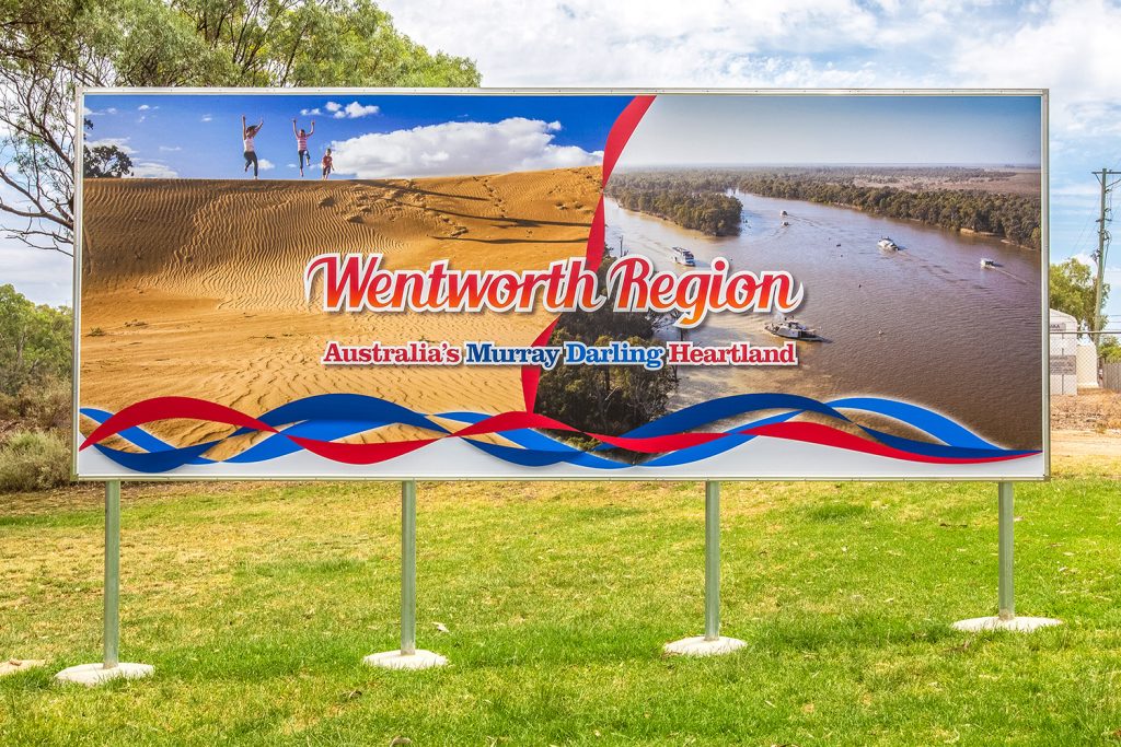
Visit Wentworth Tourism Branding
This tourism marketing strategy was built on 10 core principles. The brand worked for the Shire, community and industry. A brand that can be used across the entire region and a defined point of difference. More >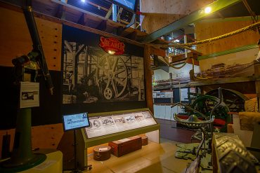
Mannum Museum and Mannum Township
Working with the Mannum Dock Museum of River History and the Mannum community has been very enjoyable. The museum is the heart of tourism in Mannum and is continually working towards improving its presence for visitors. More >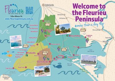
Fleurieu Penisula Tourism Branding
Once I’d worked through the current brand needs of the client we started developing different visual identity elements from both offline to online that aimed to continually build the tourism presence in the region. More >
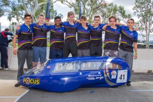
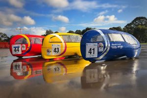
Norwood Morialta Pedal Prix Branding
The pedal prix team at Norwood Morialta High School had an opportunity to use pedal prix to promote the school and improve its image on the track. I developed a brand strategy to take implement the branding. More >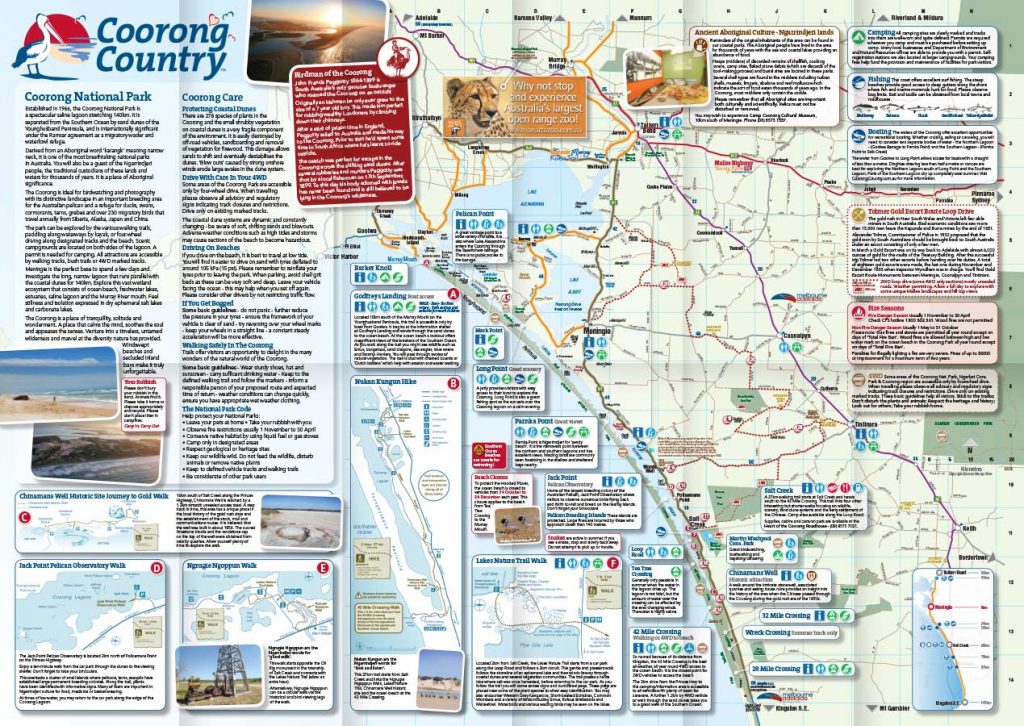
Coorong Country Branding
The Coorong and Meningie region used to be a lost landscape of natural beauty, history and indigenous culture. Developing the Coorong Country brand and supporting the local community has been very rewarding More >