AVN Worldwide Marine Services logo
Client
Graphic Design
Sector
The AVN Worldwide Marine Services logo and website reflect a tough, professional identity tailored for global marine operations. The logomark – bold, angular “AVN” letters in deep navy – projects authority, precision and maritime resilience. The concentric circle inside the “O” of “WORLDWIDE” subtly references global, and crane rotational motion, tying the mark visually to nautical equipment and the sphere of marine services.
On the website, visuals and UX reinforce that core promise: dark-blue hues, robust typography, and clean lines denote reliability. Large hero sliders spotlight heavy-duty products – cranes, propellers, dredging modules, stabilisers – positioning AVN as a provider of industrial-grade marine solutions. Navigation is clear and purpose-built, categorised by product type (Marine Cranes, Propulsion, Vessel Stabilizers, etc.), making user journeys functional and straightforward . Descriptive copy stresses performance, efficiency and global partnerships with brands like AMCO VEBA, Italdraghe, Sonica and DMS Holland.
This brand is built on engineering integrity and maritime heritage: the design rejects decorative flair in favour of a no-nonsense, capability-first message. Every visual and structural choice signals industrial-grade competence and international reach – key when dealing with technical buyers in aquaculture, shipyards, offshore and naval sectors. It’s a professional, engineered brand that delivers confidence, experience and authority.
Related projects you can Discover
ARKObots Branding
Branding developed with a young entrepreneur at high school for his educational combat robots focused on STEM learning methods. More >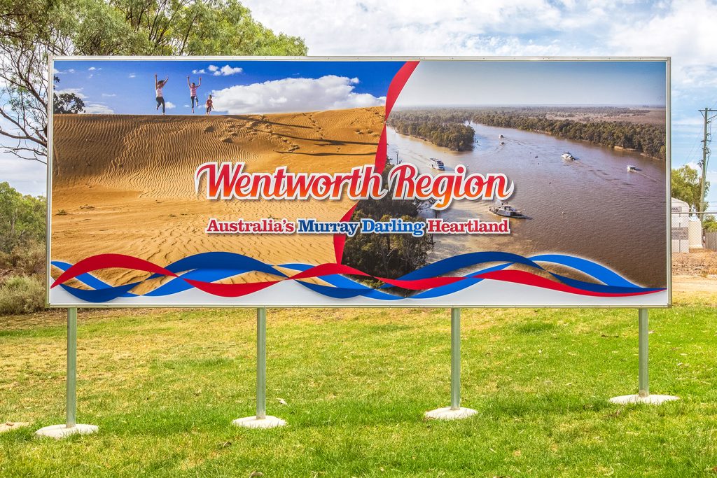
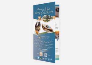
Visit Wentworth Tourism Branding
This tourism marketing strategy was built on 10 core principles. The brand worked for the Shire, community and industry. A brand that can be used across the entire region and a defined point of difference. More >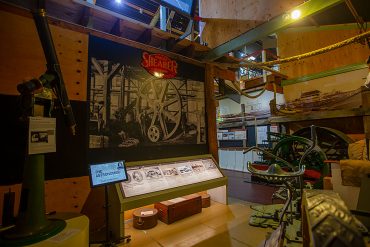
Mannum Museum and Mannum Township
Working with the Mannum Dock Museum of River History and the Mannum community has been very enjoyable. The museum is the heart of tourism in Mannum and is continually working towards improving its presence for visitors. More >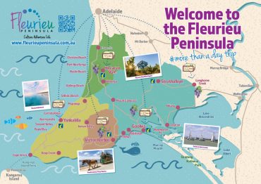
Fleurieu Penisula Tourism Branding
Once I’d worked through the current brand needs of the client we started developing different visual identity elements from both offline to online that aimed to continually build the tourism presence in the region. More >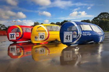
Norwood Morialta Pedal Prix Branding
The pedal prix team at Norwood Morialta High School had an opportunity to use pedal prix to promote the school and improve its image on the track. I developed a brand strategy to take implement the branding. More >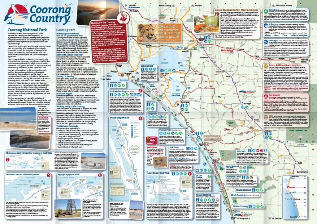
Coorong Country Branding
The Coorong and Meningie region used to be a lost landscape of natural beauty, history and indigenous culture. Developing the Coorong Country brand and supporting the local community has been very rewarding More >