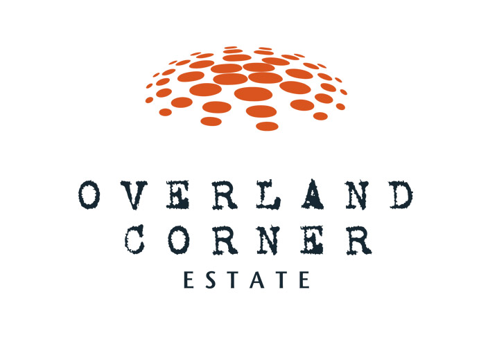
Overland Corner Estate logo design
Client
Graphic Design
Sector
Overland Corner Estate is based in the Riverland, South Australia.
They grow fruit for the domestic market and need a brand that they could stretch into other sectors.
The design of the logo was based on their rustic appeal and the natural colours in the environment.
As a supplier of varies fruits such as grapes and oranges the logo worked on the diversity of their business, showed growth and had sphere shape taking on the texture of an orange. The ochre colour was for the red earth that the crops grew i

