Discover South Australia logo
Graphic Design
Tourism Region
Discover South Australia logo
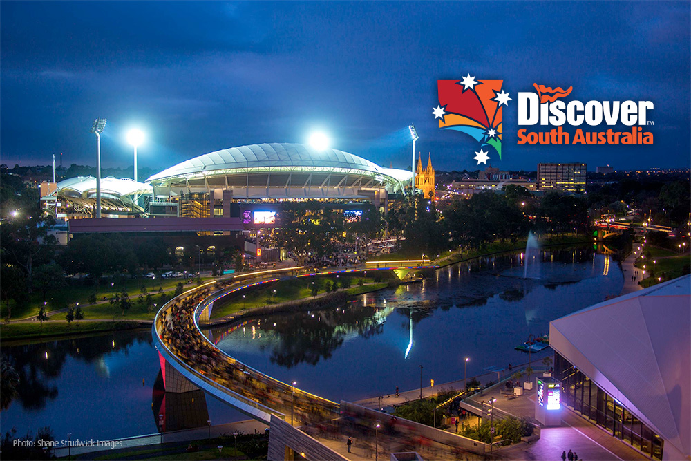
Based on the map of South Australia, Brand Action have developed a new logo and visual identity for an newly developing travel and tourism company.
The logo was based on multiple tourism and travel experiences in South Australia.
Lines represented gateways to South Australia from around the world and interstate either by road, flights or rail. The stars represent both the Southern Cross and making one star the captial for Adelaide show’s South Australia shining bright. The colours represent the landscapes of the state and diversity of community and environment along with the culture.
The text is working with an existing visual brand from the client in the world ‘Discover’ and South Australia is a strong, bold and contemporary font that makes a mark.
ARKObots Branding
Branding developed with a young entrepreneur at high school for his educational combat robots focused on STEM learning methods. More >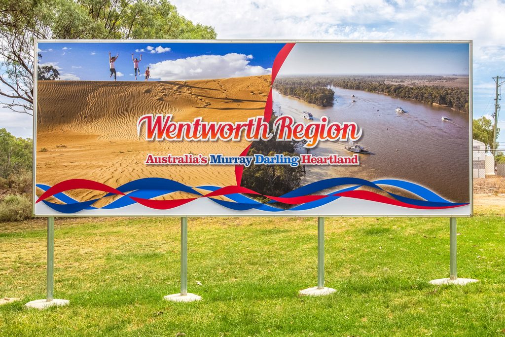
Visit Wentworth Tourism Branding
This tourism marketing strategy was built on 10 core principles. The brand worked for the Shire, community and industry. A brand that can be used across the entire region and a defined point of difference. More >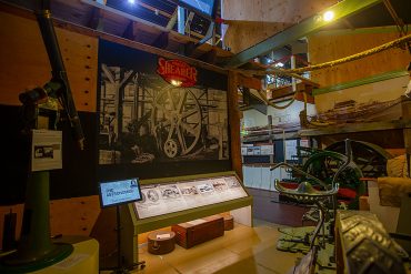
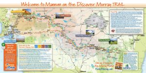
Mannum Museum and Mannum Township
Working with the Mannum Dock Museum of River History and the Mannum community has been very enjoyable. The museum is the heart of tourism in Mannum and is continually working towards improving its presence for visitors. More >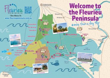
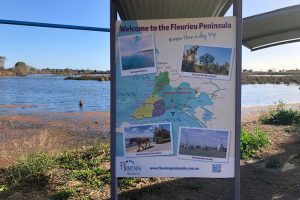
Fleurieu Penisula Tourism Branding
Once I’d worked through the current brand needs of the client we started developing different visual identity elements from both offline to online that aimed to continually build the tourism presence in the region. More >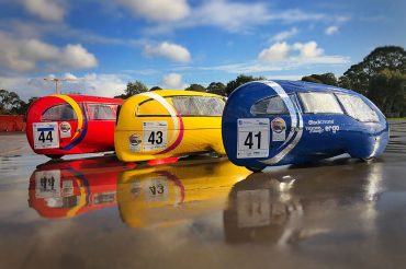
Norwood Morialta Pedal Prix Branding
The pedal prix team at Norwood Morialta High School had an opportunity to use pedal prix to promote the school and improve its image on the track. I developed a brand strategy to take implement the branding. More >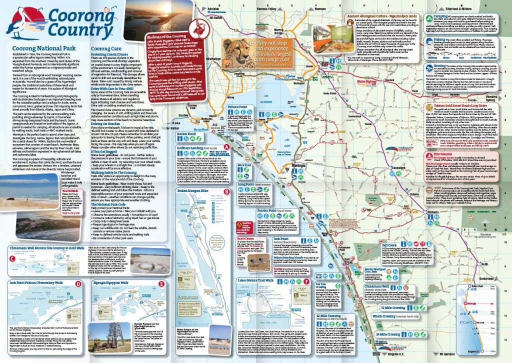
Coorong Country Branding
The Coorong and Meningie region used to be a lost landscape of natural beauty, history and indigenous culture. Developing the Coorong Country brand and supporting the local community has been very rewarding More >